Thursday, May 6, 2010

Poem Book Concept


The poem I based my book on is entitled “Soutod” by Till Lindemann. It is a lovely German piece seemingly about a man hunting deer in the pine forest. However, knowing the twist in former works of the artist, one can deduct that the writing is clearly about the hunting and molesting of a person. With this in mind, the concept of my poem book is the illustration of that story. I found a deer on the front to be a fitting cover because this is what one observes upon first viewing the poem. As the reader digs deeper into the context of the writing, they begin to whiteness that the prey is not an animal. This is why as the viewer of my piece goes deeper into the book and folds back the pages they begin to view the people being referred to as deer. Finally, after all the pages are removed one bares witness to the figure of a woman where the deer once was, thus completing the parallel.
As for the construction of the images I composited drawings with digital photos of a pine forest as depicted in the poem. I felt it important to keep the forest background up until the last panel of the book to keep more of the imagery of the poem. In contrast, the final page consist of an ally way background to further confirm the readers beliefs that the man in the poem was preying upon a young woman all along.
The drawings were all created as sketches on paper then brought into illustrator for coloring and manipulation through live paint/trace. After being colorized in illustrator they were given shadows and warped to root them into the backgrounds. The text was also manipulated through illustrator. It was given a new font, size color and shape that I felt attributed to the situation of the poem. From there the text was then placed into the images through photoshop and warped to also root it to the depictions. The physical book was created by cluing the images to two paper boards and cutting the top board into six panels so that the viewer can slowly uncover the image within.

Saturday, May 1, 2010


My piece is entitled “You Never Know Just How You Look Threw Other People’s Eyes” as suggested on the front cover. The concept I strived to portray for my self visualization project is the image others view me as, as opposed to who I really am. I did this by creating an image comprised of 3 separate depictions of myself. The first depiction of me in a pink room in a cat had it the lighter side that many view me as. It is both happy and childish due to people’s assumptions of a bubbly nature and young age. I chose this image because it is one that I am most recognized as, though it is not an accurate portrayal of myself. Likewise, the image to the far right is also an inaccurate portrait of myself that many have seen me to be. This depiction possesses darker and a more menacing air about it due to many people‘s negative reactions to my person. I chose these specific images because of the greatest contrast between the two and the personal experiences tied to them. For example, the comments I’ve received from complete strangers “I can’t wear a cat hat because I’m an adult” as well as “are you a Satanist”. As for the center rendering of myself, unlike the others, it is not drawn but a digital photo of me. I felt it important to use a real photo of myself because it introduces an aspect of reality not shown anywhere else in the piece. The significance of this in relation to the concept, is that the reality of who I am is different from the fabricated renderings viewed from the minds of others.
The images was created through manipulations of drawn images scanned into Photoshop and Illustrator. After drawing all but the center depiction of me, I used Photoshop to adjust the thresholds to generate a cleaner picture. After cleaning up the drawings, I transported them into Illustrator to color them. For the coloring I made live traces of the images, closed all the gaps through vector manipulation, then colored them through the use of live paint and the paint bucket. After I was satisfied with the colors, I brought the images back into Photoshop. From here I added shadows to the pictures to give them a weighted appearance in the rooms. Furthermore, I melded all the rooms together an did a few small manipulations with opacity, transforming, warping as well as other Photoshop elements to give the images accurate proportions and angles.

Saturday, April 17, 2010

Sautod/Sowdeath by Till Lindemann. The poem I've chosen for my poetry book project

Sautod/Sowdeath (English translation)

I have been in heat for days
so I’ll go and hunt a female deer
and until the morning I will sit there hidden
so that I can give it a shoulder shot

A pregnant doe
will soon give birth
so I have to go without it
can’t hunt it out

A young female deer comes to her feet
has sunned herself in the high reeds
makes good slot deep into the pine forest
the mirror gleams I take aim

The scut jerks like Fingereel
the shotgun jumps from the sheath
I sweep the bast from the horn
and adjust the ironsight

She feels the muzzle energy
red sweat drops off her knee
I carry her over to the Luderplace
then I finish the hunt

From the genital drops lard
I bell on the good mating season
then I drag her into the corner
and beat her out of her fur

Wednesday, April 14, 2010

Text Exercise

Student Exhibit Proposal Review

Exhibit Proposal: Sci-Fi Night Club
Artist: Erwin Redl, Leo Villareal
This would be an important exhibit based on it’s ability to show people different aspects of modern art. It does this by appealing to the use of technology as a second nature when creating works of art. Furthermore, the exhibit immerses the viewer in the artwork for a better experience. If these two artist created a show together it would prompt thought it’s constant flow. The artist style of creating artwork that’s more fluid through light really stimulates the audience and allows them to find their own personal meanings in each one of the works. Finally, the residual change in the pieces prompts the viewer to examine the artwork longer and beckons a return trip to the themed exhibit.

Exhibit Proposals: Living Computers
Artist: Laurent Mignonheau/ Christa Sommerer, Rafle Lozano-Hemmer
The importance in this exhibit lies in it’s interaction with the viewer. Based on these artist previous works, any exhibit they construct promises to have pieces the viewer doesn’t just look at, but experiences. This quality would make the exhibit interesting for people in all walks of life, thus expanding art to today’s youth. Another beneficial quality of this exhibit would be that it wouldn’t be easily forgettable. Due to it’s interaction with the audience, the exhibit would say firmly rooted in one’s mind for years to come. This exhibit would be exciting, unexpected, and would intrigue people to come and see it for themselves.

Exhibit Proposal: Independence
Artist: QS Serafijn, Gerhad Mantz
This would make an interesting exhibit because as opposed to the direct approaches to art exemplified by many of the other artist we’ve seen, this art is more subtle and requires noticing. The subtle approach to theses pieces forces the viewer to pay attention to the work if they want to appreciate it to it’s full potential. Likewise, the strength in this exhibit lies in it’s ability to connect people. This is seen through works like the giant color changing heart. Pieces similar to this in an exhibit would show people in the city, a place where one can often feel isolated in crowds, that in their feelings they are not so alone.

Exhibit Proposal: Perceptions
Artist: Oliver Wasow, Gregory Scott
This exhibit would be greatly visually and mentally stimulating. It would really push the limits on many viewer’s perceptions of reality. Furthermore, the more serious and weighted appearance in many of the works adds a very powerful factor to the works even though they are not reality. This exhibit would really inspire the viewer to take time to appreciate it because most of the twist in reality aren’t noticed at first glance. The union between the physical world and the surreal also greatly prompts the viewer to give credit to the pieces. Finally, an exhibit as powerful as this would inspire any artist who came to see it to push the boundaries of what they can do with their own works.

Exhibit: Robotics
Artist: Ken Rinaldo, Ken Feingold
This exhibit would greatly emphasize our connection to technology in the modern world. The use of robotics would intrigue viewers and challenge their perception of what art can be. Furthermore, the use of human heads in some of the works would give the exhibit an unsettling quality. The uneasy feeling the audience would get would serve to make the exhibit more powerful. This ensures that this exhibit would not be something one could easily forget.

Monday, March 22, 2010


This is my 2ed illustrator practice. It's a vectorized image of my face, created with the live paint/trace tools in adobe illustrator.

Monday, March 15, 2010

My first attempt at illustrator

Marina Abramovic, Frida Kahlo, and Cui Xiuwen comparison

The artist Marina Abramovic has a natural ability to capture the reality of human life. Though she is a performance artist working on solo pieces she portrays feelings that apply universally to mankind. In support of this her piece “Happy Christmas” is not what one would call “pretty” in the generic sense. The depiction of her face with a mixture of tears and mucous seeping from her orifices presents to the viewer an air of sadness we can all relate to. Furthermore, Abramovic concerns herself with discovering her limits in both the physical and mental sense. Knowing that the artist is performing to the brink of which her body can withstand adds to the theme of pain, which is often depicted in some form or another throughout many of this artist works.
This is not uncommon to the artist Frida Kahlo. The idea of pain and discomfort can be witnessed in a few of he artist’s works such as “The Little Deer” and “A Few Small Nips”. Also like Abramovic’s works Kahlo does not beautify her pieces to be pleasing to the eye. The artist leaves in all of the imperfections to better capture the reality of the hardships she has had to face in life.
Cui Xiuwen’s works however, appearing more calm and peaceful at first glance also force the viewer to take in the discomforting facts of existence by not depicting a perfect world. Notice how many of the structures seem to crumble around the figures in her works. Moreover, the young girls depicted in her pieces are sometimes shown with injury. This helps to drag the viewer away from a pretty and secure sense, thus showing them more of the real world.
In further comparison, Xiuwen uses images females that appear similar to herself. This is homogeneous to how Kahlo depicts herself in her works, and how Abramovic chooses to appear in her pieces as opposed to using someone else. By using themselves, the artist present the audience with yet another call to the realism of their works. If they had used models, it would take away from the sense of relate ability and the glimpse they are giving into their worlds.

Monday, March 1, 2010

Sunday, February 14, 2010

Reaction to class reviews

Upon the review of my classmates’ reaction to the artist, I realized that there were more aspects to the pieces that I had been missing. Some called to attention the specific placement of the figures. I previously hadn’t accounted for the artist intentional setting of the people in their pieces, and why they have been set in such ways. Similarly, before reviewing my classmates’ reactions I hadn’t taken in the dream like qualities if many of the pieces. Many of the works take a piece of reality and twist it just enough so that the viewer begins to question it, as if they had somehow fallen asleep without realizing.

Project 1


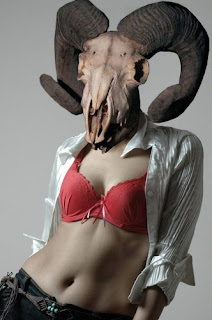
I combined these two images simply because of the contrast between them. The beauty of the female figure when coupled with the desolate image of a ram’s skull is ideally supposed to accentuate the differences in what people’s original reactions to the images on their own. Furthermore, the woman’s body is demeaned by the skull, while the animal remains are slightly glorified by the body. The woman gives the bones life as the skull presents the viewer with an air of death. Ultimately my goal was balance.
I have photoshoped images for quite some time now, though this is one of the simpler pictures I’ve manipulated

Monday, February 1, 2010

Artist Review

Aside from the obvious human subjects in many of the works, the artists share a similar use of space in many of their pieces. Upon viewing these pictures, one can sense the depth in the pictures. Further conformity of images of papers caught on the wind, and other air born substances help relay an air of freedom to the viewer. Certainly one does not feel entrapment from artist Teun Hocks’s depiction of men hanging from ceiling lights. However, artist Cindy Sherman differs from her peers by setting her works in more of an enclosed space. Centralizing her works more upon the study of women, this could be to better capture the figure. Moreover, where the other artists manipulate color to shift the overall mood of their pieces, Sherman has set her works to tones of black and white. This forces her work to convey a message through values of grey, body postures and facial expressions.

Sunday, January 31, 2010

An image that inspires me


I posted this image as one that inspires me because it encompasses many aspects of art that I enjoy working with. These being, the female form, broken up figures and nature. I’m not certain what exactly draws me to these elements, but they often resurface in many of my works. I felt this picture well reflected my inspirations. Furthermore, I adore this picture and the anime from which it was themed after.